What Are the Best Paint Colors to Brighten Rooms With Little Natural Light?
December 28, 2023
Table of Contents
- How Does Sunlight Affect Interior Room Paint Colors?
- How Does Artificial Lighting Affect Interior Room Paint Colors?
- What Paint Color Reflects Light the Best?
- Why Does My Paint Color Look Different on the Wall?
- Wall Paint Color Recommendations to Brighten a Dark Room
- Interior Paint Accents for Low-Light Rooms
- Spruce up Your Home With a Fresh Interior Paint Job From Shoreline Painting
The Best Paint Colors to Brighten Rooms With Little Natural Light
Have you ever decided on a paint color, only to have it show up differently on the wall in your home? This phenomenon is a common one when it comes to painting interior walls with varying degrees of natural or artificial light. Some rooms in our homes get less natural light than others due to their positioning, the number of windows and doors and the tone of the artificial lights. Powder rooms, hallways and basements, for instance, usually have less natural light than other parts of a house.
No matter what interior room you decide to paint, considering the source and quality of light — or rather, the absence of light — in a given space is crucial to choosing colors for it.
How Natural Light Affects Interior Paint Colors
The way sunlight streams into a room changes how paint colors appear on your walls. Color is our perception of wavelengths of light reflecting off a surface. Sunlight’s spectral composition shifts in its warmth, coolness and intensity throughout the day.
Even the direction of the light coming into the room affects the color:
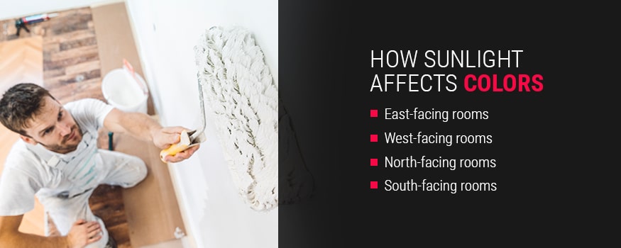
- East-facing: Rooms that face east experience warm, yellow morning light that turns cooler by afternoon. Opt for colors that handle both. Creamy whites or soft greens can embrace morning warmth, while balanced neutrals or blues transition into the evening. Avoid anything too stark that might feel icy later in the day.
- West-facing: A west-facing room receives intense, warm afternoon light. The time of day you use these rooms can influence the ideal color choice. Warm yellows, terracotta or neutrals suit morning use when there’s less natural light. Cooler-toned greens, blues or neutrals are ideal for late-afternoon or evening use.
- North-facing: Your north-facing rooms receive less light than other orientations. Colors here appear deeper and cooler. Offset this coolness with a warm-undertoned neutral or light shade, like a muted peach. Avoid dark or cool-toned colors, which can make the room feel colder.
- South-facing: These spaces enjoy abundant natural light, making colors appear truest to their swatch. In these spaces, lighter colors glow, and deeper hues keep richness without feeling heavy. These rooms are versatile, accommodating bold choices or nuanced neutrals.
Beyond direction, natural light is dynamic. Time of day, weather and seasonal changes all alter a room’s illumination. Paint sample colors on your walls, then observe them in varying conditions to reveal their true character.
How Does Artificial Lighting Affect Interior Room Paint Colors?
Artificial lighting can also play a role in how paint colors look in both commercial and residential spaces. Artificial lighting like light bulbs can be used to supplement natural light or replace it entirely. Types of artificial lighting are:
- Fluorescent lights: These bulbs amplify blueUpdas and greens by generating cool, blue light. They also tend to mute warmer colors.
- Soft white fluorescent lights: These bulbs generate a warm, yellow light that can have a fading effect on all paint colors.
- Full-spectrum fluorescent lights: These bulbs most closely resemble natural sunlight.
- Incandescent lights: Incandescent bulbs will dull cool hues and make warm hues appear more intense due to their yellow and warm light.
- Halogen lights: These bulbs produce brighter, white light that mimics sunlight and can make any room appear naturally brighter.
If your house utilizes different light sources, you may want to consider using different colors in each. The same color will look different under various forms of light.
What Paint Color Reflects Light the Best?
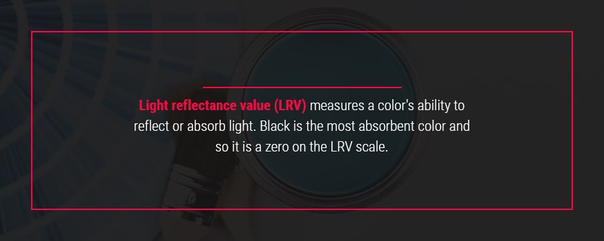
Light reflectance value (LRV) measures a color’s ability to reflect or absorb light. Black is the most absorbent color and so it is a zero on the LRV scale. Pure white, being the most reflective color, is at the other end of the scale at 100 because it doesn’t absorb light or warmth. Colors that fall below 50 on the LRV scale will absorb more light than they reflect. Shades above 50 help create a daytime look and add a feeling of expansion to a space.
In reality, all colors reflect light except for black. When you’re looking for the best colors to use in low-light rooms, your best bet is to go with shades that increase the sense of space.
Artificial Lighting and Paint Colors
Sunlight covers the full spectrum of light wavelengths, showing a truer representation of color. Artificial lighting contains certain wavelengths and temperatures. These characteristics change how we perceive color. To master interior paint choices, it helps to understand two light qualities — color temperature and rendition.
Color Temperature
Color temperature, shown in Kelvin (K), measures the warmth or coolness of light. The higher the Kelvin, the cooler the light. Here’s how different temperatures affect paint colors:
- Warm white (2000K to 3000K): Bulbs in this range mimic traditional incandescent light with a yellowish glow. They enhance warm paint colors, creating cozy atmospheres in living rooms or bedrooms.
- Neutral white (3100K to 4500K): These bulbs deliver a more neutral, crisp light. They are ideal for task-oriented spaces, like kitchens or offices. These bulbs help paint colors appear true and vibrant.
- Daylight (4600K to 6500K): This lighting is the closest to natural midday sun. It can provide clarity in workshops or studios, but it can make paint colors feel stark in general living areas.
Color Rendering Index
The Color Rendering Index (CRI) indicates the accuracy of color reproduction by a light source on a scale of 0 to 100. Higher CRI values help paint colors look as intended. Choose lighting with a CRI of 90 or above for accurate paint colors.
Today’s LED lights often have a high CRI value. They offer exceptional energy efficiency, longevity and versatility across all color temperatures. Some LEDs even allow you to adjust color temperature, providing dynamic control over your paint’s perceived hue.
Test your paint samples under the actual artificial lighting conditions. Observe them in the evening for the most accurate preview of your chosen colors.
The Best Interior Paint Colors for Dark Spaces
Finding the right paint colors for low-light rooms can be a challenge. Every color will say something about your home and lifestyle, and you want to make sure the colors you choose will accomplish the look and feel you want. Some colors make spaces appear larger by making them brighter, and others will embrace the coziness and tranquility of a dark room.
Here are the best paint colors for dark rooms that can change your space:
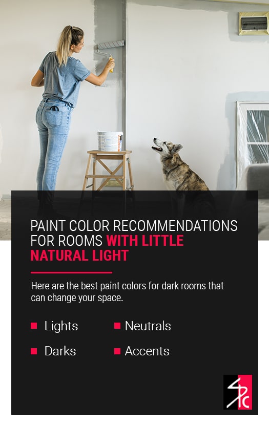
Light Wall Paint Color Options
Light colors are great to utilize in a room with little natural light. Light paint colors for small, dark rooms are a quick and straightforward way to make a space feel airy. If your goal is to make your low-light room feel brighter, light colors are a great way to go. Light colors are some of the best colors for a dark bedroom, but you can utilize them in many spaces.
Light and bright colors that are great for dark rooms include:
- Light blues: Light blues are very serene colors that create a relaxing feeling. They can open up a room beautifully and are great for pairing with undertones in colors such as beige. Blues are beautiful in spaces where you want to promote relaxation, such as bedrooms and bathrooms. Blue colors for a dark living room can also be welcoming and relaxing for guests.
- Pale yellow: Pale yellow is uplifting and welcoming. It is best in rooms where you want to experience energy and happiness. Kitchens and dining rooms are typically social spaces where people gather and want to feel welcome. Pale yellow is also gorgeous in bathrooms.
- Sage green: Sage green represents growth and freshness. Despite its complex composition, sage promotes a tranquil, harmonizing feeling and is great in spaces where you want to feel relaxed, like the bedroom and living room. Greens are also great for hallways to expand your space.
- Blush pink: Blush pink is a warm color that inspires hope and soothes harsh energy. It has a calming effect and is linked to innocence. The bedroom and office are excellent places for blush pink walls because of their soothing effect.
- Lavender: Lavender is a youthful color that evokes a sense of serenity. It is associated with creativity and optimism. It’s a beautiful color for bedrooms and bathrooms that can open up the space while promoting decadence.
Dark Wall Paint Color Options
Dark colors can make the corners in a room seem to blend together and open up a room. If you want to embrace the coziness of a dark room while expanding its look, dark colors may be the way to go. The best paint for dark rooms will make spaces feel cozy without feeling cramped, such as:
- Black: Black is created by mixing blue and brown together. Depending on the concentration of each color, black tones can be warm or cool. You can use black to add sophistication to any room or as a beautiful accent that will ground the rest of the color scheme.
- Dark blue: Dark blue can be intense and inspire clear thoughts and reflection. Blue has a calming effect and can be great in bedrooms, offices, bathrooms and other spaces where you like to reflect. Because blue has so many shades, it can be great for layering.
- Dark red: Dark red can give your home a traditional and rich touch. Red tends to spark conversation and is excellent in social rooms such as the kitchen, living room and dining room. Reds are gorgeous when paired with earth tones and neutrals like cream, which can make a space feel inviting and comforting.
- Plum: Plum is a dark red mixed with purple. Plum, compared to other shades of red, can add depth. In dining rooms and bedrooms, it can feel elegant and traditional. The blend of purple and red gives plum a sophisticated look that can radiate a sense of power.
A popular strategy for using dark colors in rooms with little natural light is to paint one wall a darker color and leave the other walls white. Also called an accent wall, this use of dark paint can help brighten up a room by providing contrast to the lighter colors.
Neutral Wall Paint Color Options
The best neutral paint for a dark room is one that will reflect light to brighten your space. Neutrals can be perfect accents for other colors, making them very versatile and able to fit into any room seamlessly. They can add warmth, and you can incorporate undertones and accents to create the mood and look that you want.
The best neutral paints to use include:
- White and cream: White and cream may seem similar, but their tones are different. White is elegant and can create an open feel in any room. Cream is softer than white, and can create a timeless aesthetic. It has warm undertones that make a room feel cozy.
- Beige: Beige is essentially white with a tasteful hint of brown. It’s a beautiful color to implement subtle undertones to bring out different colors in your home. It is usually a warm color, but the undertones can affect its overall feel. Because of its versatility, beige can be an excellent color for any room.
- Gray: Grays can be warm or cool and can create soft, open spaces. Gray is also excellent for pairing with other colors. The minimalist look that gray can accomplish can be great in any room, and cooler shades can act as a gorgeous accent wall.
- Chocolate brown: Brown is often a warm color, but you may find some brown colors with cool undertones. Warm shades such as chocolate brown can make a room feel cozy. It is a traditional color that adds a touch of elegance.
- Tan: Tans tend to have a green or yellow undertone and are soft. Tan is more subdued than beige and can sometimes cast gray hues. Tan can create a more grounded look and feel less rich than beige, making it a great neutral in any room.
Interior Paint Accents for Low-Light Rooms
There are no right or wrong ways to incorporate color into your home, and if you don’t want a monochromic look, consider adding unique accents to your space.
Using a matte color for an accent wall will create a stable focal point that looks similar in most forms of lighting. Matte colors make a flat, even surface of color that attracts the eye when you walk into the room. In a living room, walls with a fireplace are excellent for matte walls. If you have a dining room or other space with columns or other eye-catching structural pieces, that would be a great place for a matte finish.
Meanwhile, using a high gloss paint for an accent wall creates a reflective surface that will allow the light your room receives to bounce around. Light-reflecting paint for dark rooms can make a space feel more breathable. Painting your trim in a high gloss that coordinates with the rest of your room can brighten it up and give an elegant sheen to any space.
Any accent you create should coordinate with the rest of your palette. Professionals at Shoreline Painting will be able to tell you what colors would best blend together and whether you should incorporate an accent wall with a specific finish.

Spruce up Your Home With a Fresh Interior Paint Job From Shoreline Painting
Shoreline Painting is a fully bonded, licensed and insured Fine Paints of Europe Master Certified Painter, which means we use only the finest painting tools and products available on the market today. For more than 35 years, Shoreline has provided both interior and exterior painting services for homes throughout Westchester County, New York City and cities throughout Fairfield County, including Westport, Darien, Greenwich and New Canaan. Browse our portfolio of completed projects for examples of our superior artistry.
Contact us today to schedule an interior painting consultation.
Paint Color FAQs
Selecting the perfect paint shade for low-light areas has plenty of considerations. The experts at Shoreline Painting can help you navigate these dynamics and answer questions like these:
What Paint Color Reflects Light the Best?
The simple answer is white. However, when it comes to paint colors, the answer is not so simple. First, you need to understand light reflectance value (LRV). LRV measures the percentage of light a color reflects, ranging from 0 (darkest black) to 100 (brightest white). A 0 rating means the color absorbs all light, while 100 means it reflects all light.
When deciding on a paint color, consider the paint’s LRV together with the room’s lighting conditions. High-LRV colors make a room brighter and distribute light well. They can boost energy efficiency in a room by reducing the need for artificial light. These colors also create an illusion of more space.
Strategic Choices for Light Reflection
While bright whites reflect the most light, choosing the right paint LRV has other considerations:
- Natural light: In rooms with plenty of natural light, choose a medium LRV. For darker rooms, use a higher-LRV paint to make the space appear lighter.
- Artificial lighting: Low-Kelvin bulbs make high-LRV reds, yellows or oranges more vibrant. In rooms with brighter lighting, you can get away with lower-LRV blues, greens or grays.
- Space: High-LRV colors open up confined areas like hallways or powder rooms. Low-LRV shades can make larger spaces feel more intimate.
- Paint finishes: High-LRV colors, especially with a slight sheen, can produce a soft, luminous glow as light plays across the surface.
Why Does My Paint Color Look Different on the Wall?
The journey from a paint swatch to a full painted room can often reveal unexpected color shifts. Besides lighting, these factors influence how your chosen paint color appears on your wall:
The Crucial Role of Primer
Primer is foundational for true color representation. It prevents underlying wall colors from bleeding through and altering the new paint’s hue. Primer equalizes surface absorbency across different wall materials. It creates a uniform base, ensuring even drying while preventing splotchy or streaky finishes. Primer also improves paint adhesion and durability.
Understanding Undertones
Every color, even neutrals, carries subtle undertones — hints of blue, green, yellow, pink or purple. These become prominent on a large surface and interact with room elements. A “warm gray” might appear green next to red decor if their undertones clash. Identify undertones by comparing the paint chip to pure primary colors or looking at other shades on the same paint strip. Consider how these undertones will interact with your flooring, cabinetry and existing furniture.
Sheen’s Impact on Perception and Durability
A paint’s gloss level, or sheen, affects color perception due to its reflectivity:
- Matte or flat: Since flat paints absorb the most light, they give the truest color representation.
- Eggshell or satin: This type of paint reflects some light. Its subtle glow can make hues appear lighter or brighter.
- Semi- or high-gloss: These finishes reflect the most light. Their high reflectivity can ramp up the vibrancy and intensity of paint colors. They can also wash out colors because of the dramatic highlights or shadows they create.
Porosity and Surface Preparation
A surface’s porosity can cause uneven color absorption, leading to streaks or splotches. Proper wall preparation, like cleaning, patching, sanding and priming, is vital. These steps ensure a uniform, nonporous surface with even paint adhesion for a flawless finish.
Adjacent Shades and Context
Surrounding colors from furniture, artwork or even outside views can alter how paint colors appear. A blue wall might look bluer next to yellow decor. The context of the room influences how you perceive color, creating a harmonious or contrasting effect.