Uncommon Color Pairing Guide for a Unique Home
February 27, 2021

The same old color schemes can get boring after a while. If you’re the adventurous type, then you may be looking for something a little more exciting for the inside of your coastal Connecticut or New York home. You’re ready to move past white walls and safe color options, and you want to take a bold, new approach to the colors within your rooms.
If this describes you, then you should trust the professionals at Shoreline Painting to bring new life to your house with unique home color pairings. Anyone can go the safe route, but you can let your personality shine with color schemes that will set your home apart from the rest. We’ve created this unique color pairing guide to help you take your next step toward achieving your vision.
The Psychology of Color
The first thing you need to understand when choosing unique home colors is the psychology of color. Colors add more than a splash of life and personality to your home’s walls. They can change the way you feel when entering a room, which can either add or subtract from the type of vibe you want to experience within that room.
Colors can affect your mindset and mood in both subtle and noticeable ways. Consider pulling up to a stop sign or a red light. There’s a reason red is the chosen color for these most important traffic markers. Red grabs your attention and evokes feelings of energy, excitement and awareness. Green is a more welcoming and relaxing color. Like green traffic lights, the color green in a room could make you feel at ease and comfortable in your task at hand.
The traffic administrators aren’t the only ones who use the power of color to elicit reactions in people. Think of all the advertisements and marketing campaigns that companies display on billboards, commercials and labels. They’re intentional in the colors they choose because they understand certain colors may result in more sales for different products. Gas and oil companies often choose green or blue logos to align themselves with nature. Restaurants and food product companies may choose orange packaging to create a welcoming feeling.
Here’s a breakdown of some common colors and the emotions they trigger:
- Red evokes feelings of energy, excitement and confidence.
- Blue is a soothing color that fosters a calming, cooling effect.
- Yellow stirs up feelings of inspiration, optimism and happiness.
- Orange is a warm color that symbolizes wholesome and balanced feelings, and it can even stimulate one’s appetite.
- Green is an energetic color that brings feelings of nature and relaxation into the home.
- Purple stimulates the imagination and evokes feelings of royalty, wisdom and romance.
- White is a refreshing color that creates feelings of youth and cleanliness within the home.
- Brown symbolizes the earth and inspires feelings of contentment and security.
The Color Wheel
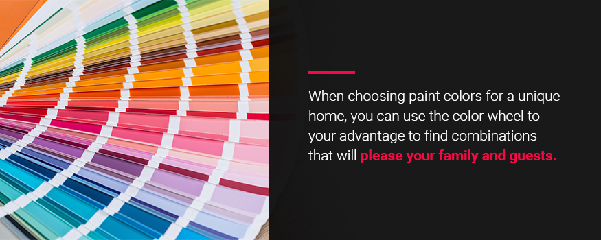
Now that you know a little more about how colors can affect your mood, you’re ready to learn how different color combinations can work together to achieve new effects. Some color combinations can create feelings in rooms that would be impossible if the colors were alone. Other colors work against each other to create feelings of tension. You can better understand the relationship between colors by looking at the color wheel.
The color wheel is a useful tool that shows you how the colors relate to one another. A quick online search will reveal different types of color wheels, but they all have one thing in common. They display the colors of the rainbow with similar shades between the familiar ones. When choosing paint colors for a unique home, you can use the color wheel to your advantage to find combinations that will please your family and guests.
Here are some terms that can help you navigate the color wheel as you start planning unique colors for your home:
- Complementary: These colors exist on opposite sides of the color wheel. This gives them the highest level of contrast, which can be a good thing. An example of complementary colors is red and green.
- Monochromatic: This includes the different tones, shades and tints of a single color on the color wheel. People often associate monochrome with black and white cinema and its gray tones, but the term monochrome can apply to any color. An example of monochromatic colors is baby blue, sky blue and indigo.
- Analogous: Three colors that exist next to each other are analogous. The colors lack the stark contrast of complementary colors, and too many in a single room can be overwhelming. But with the right balance, analogous color schemes can be unique and tasteful. An example of analogous colors is red, orange and yellow.
- Triadic: Triadic colors include any three colors that are equal distances from one another on the color wheel. Triadic colors provide some high-contrast, versatile color palettes. Red, blue and yellow are triadic colors. They may seem like they don’t go together, but with the right balance, they can achieve some unique results.
- Tetradic: Tetradic colors are any four colors of equal distance on the color wheel. Tetradic colors are bold and provide a nice amount of diversity, but be careful about adding too many colors to a single room of your home. The more colors you add, the harder it is to strike the right balance.
Warm and Cold Colors
You can divide the color wheel down the middle to split the colors between warm and cold. This can provide even more customization to achieve the unique look you want for your home’s interior walls. With this trick, you can choose colors with more intention, striking the exact balance you want between contrast and harmony. Here’s the difference between warm and cold colors:
- Warm colors are anything on the color wheel from red through yellow. These colors trigger warm thoughts and feelings in the mind. For many people, these colors remind them of the sun.
- Cool colors are the colors on the color wheel from green through blue and some purples. These colors inspire thoughts of coolness in the viewer, like a crisp, gurgling creek outdoors.
There may be certain rooms in your house that demand a warmer color scheme, such as a living room or kitchen. Other rooms may be perfect for cooler colors, like a bedroom or a finished basement. Combining warm and cool colors with complementary or triadic colors can create some unique color painting schemes.
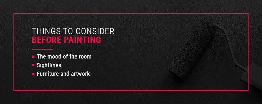
Things to Consider Before Painting
You now have the knowledge to start picking unique home colors, but you should consider a few things before gettings started. Here are some aspects of choosing colors you’ll want to keep in mind:
- The mood of the room: What type of vibes do you want in your rooms? If you’re looking to relax in a certain room, then you might want to steer clear of vibrant, exciting colors. Places with lots of activities like game rooms and living rooms may demand an exciting color palette instead of calming, soothing or familiar colors.
- Sightlines: You can make each room’s color scheme as interesting and unique as you want. But you can probably see into another room from any other room in your home. This is a sightline, and it can bring other colors into your field of vision that might clash with other rooms’ color schemes. Keep this in mind when choosing your home’s new colors.
- Furniture and artwork: The items within a room affect the vibe. Try to complement the colors in your favorite pieces of furniture and artwork. You may even choose colors in a room based on the items you plan on using in that room. Make sure you consider artwork and furniture to choose colors that coordinate with the room’s items.
Understanding Uncommon Interior Paint Colors
Let’s break down the different types of colors to help you start picking unique home color pairings. Every color falls under one of the following three categories:
- Primary colors: These colors exist on their own. You cannot mix other colors to achieve these ones. The primary colors are red, yellow and blue.
- Secondary colors: You can create secondary colors by mixing two primary colors. Mixing red and yellow creates orange, mixing blue and yellow creates green, and mixing red and blue makes purple.
- Tertiary colors: These colors form from combining a secondary color with a primary color. Colors include yellow-orange, red-orange, yellow-green, blue-violet, blue-green and red-violet.
These colors exist on a standard color wheel for interior painting, but different shades, tones and tints exist within each one. When you start picking out new paints for your home, you should keep this information in mind to guide your choices. Knowing the basic colors that make up unique colors can help you choose the right ones to create complementary combinations that will impress everyone who enters your home.
But remember that colors on a paint swatch may look different on your walls than they do on the swatch. That’s why swatches often include several colors. A color may look dark gray by itself, but its location on a swatch could reveal that it is actually a deep green. You may be able to tell this from the lighter shades of green above it on the swatch. Always remember that unique colors are combinations of primary, secondary and tertiary colors. The subtle tints matter when choosing your paint.
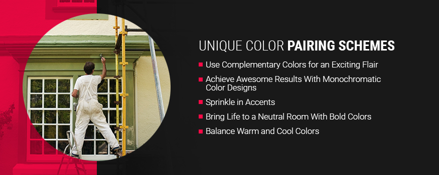
Unique Color Pairing Schemes
Let’s get into some unique color schemes you can try in your own home. Think about how certain rooms in your home would look with these paint schemes. Let your imagination go wild knowing the professionals at Shoreline Painting can get the job done with stellar results.
1. Use Complementary Colors for an Exciting Flair
One of the best ways to create a surprising color scheme in your unique home is to use complementary colors. These colors are on opposite sides of the color wheel, creating a beautiful element of contrast. It’s easy to pair a white ceiling with walls of a certain shade of blue. But what if you threw in a more complementary color, like a shade of orange?
Another great pair of complementary colors is red and green. You may associate these colors with Christmas, but with different tints such as maroon and olive, you can create a unique, balanced look. As you consider complementary colors for your home, try experimenting with different shades to create a unique color scheme.
2. Achieve Awesome Results With Monochromatic Color Designs
Many people think monochromatic color schemes are a thing of the past and not worth trying in a modern, unique home. However, many home designers are experimenting with it and getting great results. With help from the professionals at Shoreline Painting, you can achieve a monochrome room that captures the vibe you want.
Too much of the same color can be unsettling, so consider choosing one shade as the prominent color and two similar shades as the accent colors. Break up their placement throughout the room to get a little bit of contrast. When you pinpoint the exact feeling you want in a room, a monochromatic color scheme can help you achieve it without accidental color tension.
3. Sprinkle in Accents
Accents are many home designers’ secret weapon in creating a unique color scheme. Accents can take a room with a common color scheme and transform it into something unique. If you think a room in your home needs a little more creative flair, consider sprinkling in an accent color or two.
Using accents is especially useful in rooms with a monochromatic color scheme. For instance, a room with blue tones would look great with copper accents. Shades of yellow, like mustard, are also great to use as an accent with blue. You could also choose a hunter green accent wall surrounded by light grey walls or dark blue trim for your light pink bathroom. The sky is the limit for how you can use accents to change the feeling of rooms throughout your home.
4. Bring Life to a Neutral Room With Bold Colors
Neutral rooms feel clean and simple, but they can feel like they lack life after a while. Revitalize them with some bold colors to offset the calming nature of neutrals. You can use bold colors in a neutral room like you would use accents in a monochromatic room, although you can use them a bit more liberally.
Neutral colors include shades of white, beige, taupe, ivory, gray and even black. Splashes of bright red, yellow and even purple can be the solution to take your neutral rooms to the next level. For an even bolder look, consider pairing some salmon-pink with your black or gray walls. Make sure you consult the professionals at Shoreline Painting for advice on which brighter colors would look great with neutrals to make sure you achieve the outcome you’re looking for.
5. Balance Warm and Cool Colors
Balancing warm and cool colors is an important aspect of choosing unique home color pairings. Even as you experiment with some of the above color pairing schemes, you should keep the idea of warm and cool colors in the back of your mind. Balancing these colors can add another dynamic to the painting process that can help you achieve the feeling you want in your home.
Adding a touch of orange in an aqua-painted room can provide the right amount of warm feelings to the cool space. If your beige walls have a warm undertone, you can balance your room by painting the trim a medium blue. When you want to create a complex and intriguing feeling in a room, you should make sure to balance warm and cool colors.

Trust Shoreline Painting When You Want Unique Color Schemes for Your New York or Connecticut Home
When you need professional painting services to achieve a unique look in your home, Shoreline Painting is the company to call. We’re a Fine Paints of Europe Certified Master Painter, and we’re committed to quality paint jobs that will last for years to come. Your satisfaction is our priority, and we’ll work with you every step of the way to make sure the end result is something you’ll love showing off.
We even offer paint consulting services to help you pick colors so you can feel confident about the process from the start. Contact us today for more information on how we can help you achieve unique color pairings for your home. Our whole team looks forward to serving you!