Popular Interior Paint Colors for 2024
November 29, 2023
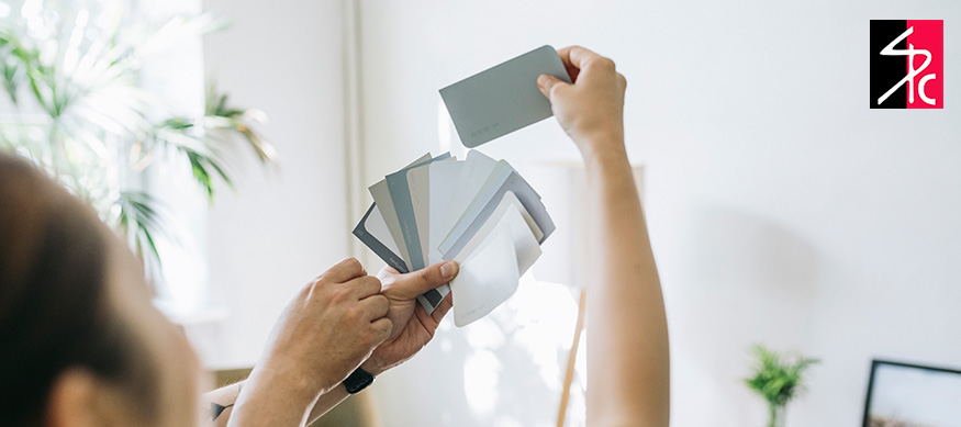
Choosing interior paint colors can be a difficult task, considering the variety of available options. With 2024 fast approaching, the latest color trends are emerging to complement the new year. A professional, luxurious paint job will provide a generous return on your investment, making it worth the effort of seeking and finding the perfect paint finishes.
While endless colors are on the market, some stand out above the rest. These colors have been recognized and awarded their top color status by leading color institutes, reputable paint companies, magazines or interior design websites. They often have votes or forecast how well specific colors will trend based on perceived popularity. The color of the year paint selection process is vast and includes many participants, eager to showcase and present their colors to a professional panel.
During the proposal, some factors influencing how a color will perform include pop culture, architecture, art, politics, technology and social power. We’ve compiled a list of the most popular 2024 paint colors below to help make the color selection process easier.
Blue Nova 825 by Benjamin Moore
Blue Nova 825 by Benjamin Moore is a bold color inspired by the cosmos. They claim that a new star was the motivation behind the color, with its magnificent blue and violet blend. The hue is considered safe and suitable for all interior walls, whether you’re looking to revamp your living area, bedroom, study or even kitchen. It’s a softer, more appealing alternative to navy blue and other deeper shades of blue, in line with the kitchen color trends of 2024.
For anyone interested in exploring new colors without being too adventurous, Blue Nova 825 is the perfect choice. It is mid-tone, not too bright or dull and strikes an ideal balance. Its depth and warmth evoke the same feelings, with a hint of mystery as you’re transported to the outer realms. It can be paired with various colors like burnt orange, brown, green, yellow and other shades of blue.
It’s also an excellent color choice to use as an accent, whether for a full accent wall or to highlight areas like window or door frames.
Upward by Sherwin-Williams
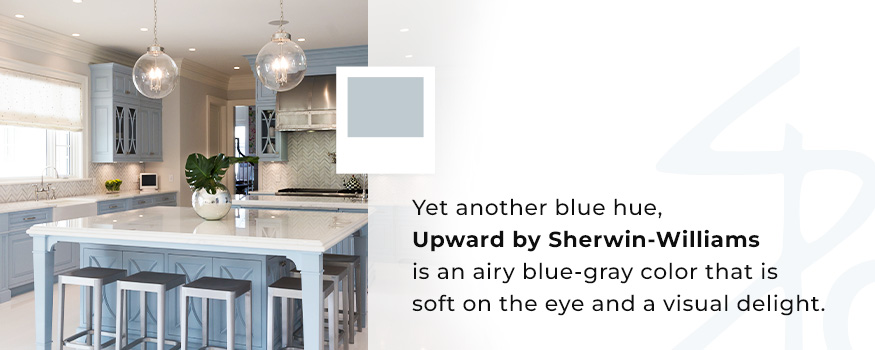
Yet another blue hue, Upward by Sherwin-Williams is an airy blue-gray color that is soft on the eye and a visual delight. It evokes a sense of tranquility and calm and promotes mental and physical relaxation.
This neutral shade can be applied in the main living areas because of its multifaceted nature. A baby nursery would especially draw attention with this delicate hue, while a reading room draped in this color would enhance feelings of peace and focus. Your kitchen cabinets will turn heads with an Upward coating.
Upward matches superbly with green, gold, beige, tan, white, gray and brown but also stands in stark contrast against deeper colors like dark browns, grays and black. You have creative reign with a color that blends as beautifully with others as this does.
Bay Blue by Minwax
Leaning toward an illuminating blue-green shade that resembles turquoise, Bay Blue by Minwax is nominated as one of the most popular colors for 2024. It strikes a beautiful balance between being bright and soft.
Bay Blue is deep and satisfying and makes you feel alive. It is stylish and sophisticated and easily matched with an array of color hues. Pair it with white, brown, pink, yellow and purple accents or apply it to a feature wall if the color is too bright to use on all the others.
Spa Day Latte by Fine Paints of Europe
You might be tempted to taste this color when you first see it. The creamy, ivory, rich yet subtle color reminds you of a freshly made vanilla chai latte. It is simply irresistible with its light, variable tone. Promote consistency as you sweep the color across all interior walls, adding bold hues like navy, red or brown to accentuate features such as windows and the fireplace. Or, retain a neutral effect with softer colors like aqua, turquoise and rose.
Spa Day Latte’s inherently natural tones are warm and cozy with a touch of romance. It is perfect for all seasons and will remain timeless.
Call Shoreline Painting for Your Next Interior Painting Project
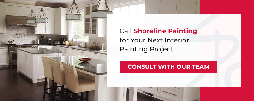
At Shoreline Painting, we proudly present clients with the best. As Fine Paints of Europe Master Certified Painters, we deliver quality workmanship using only the best paints. Our top-quality services include a variety of paint types for long-lasting finishes and we go out of our way to keep our valued clients happy.
If you’re ready to take us up on our promise to provide the best service excellence, reach out to request a consultation today.
Recent Posts


Follow Us


