How Paint Colors Affect Mood
May 15, 2024
Choosing a new room color is often a challenging task. People commonly choose paint colors based on personal preference or to coordinate with other pieces in the room, but the psychology of paint colors is another important consideration. Beyond whether or not you like a color, your paint choices can actually influence your mood when you’re in a particular room. What are your walls saying to you, and how are they making you feel? Check out these popular room color choices and how they affect mood before you make your final paint selections.
Feelings and Meanings of Different Room Colors
Diving deeper into the psychology of each color helps you better understand how wall paint colors affect your mood. In general, lighter colors make your room feel larger and brighter. Darker colors tend to create warmth and sophistication. Darker colors can also create an intimate feeling, which is particularly beneficial in large rooms. Whether a color is warm or cool also works into the equation of how you feel when you see it.
Explore each of the following colors and their effects to start narrowing down your options:
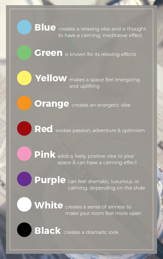
Blue: Blue creates a relaxing vibe and is thought to have a calming, meditative effect. It might lower your blood pressure, respiration and heart rate. Blue encourages clear thinking and productivity. Some shades of blue have an unpleasant chilly look, however, particularly when a room lacks natural light. Using warm hues in your accents can help balance that chilly effect.
Green: Green is another color known for its relaxing effects with a sense of tranquility, composure and quiet. It adds some of the cheerfulness of yellow to the refreshing effects of blue for a balanced approach to relaxation. Green also tends to have a restorative effect, possibly due to its prominence in nature, and it feels refreshing to look at. This versatile color option works in almost any room of the house when you want a comforting space that allows you to unwind or feel at ease.
Yellow: Yellow makes a space feel energizing and uplifting with a touch of joy and happiness. Yellow can make a room feel more expansive while creating a welcoming feeling. On the flip side, large amounts of yellow seem to have a negative effect, potentially causing people to get angry or feel frustrated more easily.
Orange: Orange creates an energetic vibe. It can spark your sense of enthusiasm and make you excited while stimulating your creativity. Orange also offers a sense of warmth and can make your space feel cozy. It also tends to have a stimulating effect on your appetite.
Red: Red evokes passion, adventure and optimism. It elevates the energy in the room and creates a sense of excitement. Red may increase blood pressure, respiration and heart rate, so use it with caution if you want to avoid this type of stimulation. The intense color is often associated with stimulating the appetite and encouraging conversation. It also helps create an intimate, comforting feeling.
Pink: While pink is often associated with little girls’ rooms, it has a place in other spaces for its romantic, joyful effects. Pink adds a lively, positive vibe to your space, and some shades have a calming effect.
Purple: The effects of purple depend on the shade. For example, dark, rich shades such as eggplant make a dramatic splash in your room. It creates a sense of luxury and is often associated with creativity. Lavender, lilac and other lighter shades of purple offer calming effects similar to that of blue. Unlike blue, light purple doesn’t create the cold, chilly feeling.
White: This versatile neutral color creates a sense of airiness to make your room feel more open. White also creates a sense of cleanliness, simplicity and purity. White is a color option that works almost anywhere. It creates a crisp, clean background and provides a great contrast for the accent pieces, furniture and accessories you add to the space.
Black: Black creates a dramatic look in your space. It also carries a connotation of elegance and sophistication with a formal tone to it. Black has a grounding effect and can add depth to your design. While it can work well to evoke these feelings when used as an accent color, using too much black in a space can have a negative mood-altering effect, leaving you feeling depressed. Black also tends to make a room feel smaller, which is something to consider if your space is already limited.
Bedroom Colors
At the end of your long, busy day, your bedroom is your retreat. Most people want a relaxing environment that stimulates sleep. For this reason, avoiding red and other stimulating colors is usually a smart move. The last thing you want to do when you’re trying to fall asleep is feel stimulated with increased blood pressure.
Instead, choose a color known for tranquility and relaxation. Blues and greens are the best calming colors to paint a room, which is why they work well in the bedroom. Lavender is another cool color that helps create that tranquil feeling without the potential for chilliness that sometimes occurs with blue.
Kitchen and Dining Room Colors
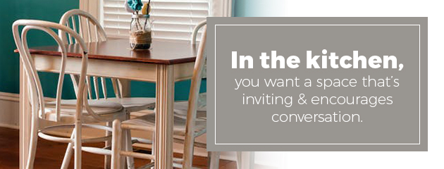
Kitchens often serve as the heart of your home, whether you’re entertaining guests or simply cooking dinner for your own family. You want a space that is inviting and encourages conversation.
Choosing red or orange for your kitchen and dining room helps stimulate appetite. This is the perfect option if you want your dinner guests to eat up. However, if you’re concerned about overeating, you may want to avoid those colors in areas associated with eating. Red in those spaces may cause you to eat more than normal on a subtle level you might not notice.
Red is also thought to stimulate conversation, which is perfect for a dining room when you want to encourage dinner conversation or a kitchen where family and friends gather. If you do choose red or orange, consider how much of the color to add. Painting your entire dining room or kitchen with such an intense color can feel overwhelming.
Warm colors create an energetic environment in the kitchen. This is ideal when you want to create a fun environment that focuses on energetic interactions. Peach, terra cotta and similar colors create that effect. Blues and greens also work in a kitchen or dining room when you prefer a more peaceful setting for cooking and enjoying your food.
Another strategy for choosing your kitchen color scheme is to think back to your own childhood. If your memories of spending time in the kitchen are positive ones, using the same colors from your childhood kitchen can help recreate those positive feelings.
Living Room Colors
Your living room or family room is the place you gather with your friends and family. It is meant to be a comfortable, relaxing space where conversation flows. You also want a warm, welcoming feeling in this space so people feel like they can come in and connect.
Green in the living room or family room gives you permission to relax and unwind while still maintaining a warmth that keeps you comfy and encourages togetherness. Blue has a similar relaxing effect in family or living rooms. Choose a warmer shade of blue to keep the space welcoming. Bright shades of blue, such as turquoise, also work well in common spaces. Avoid dark shades of blue. The darker hues can cause a sense of sadness. While darker blues can work as accents, avoid them in your main color scheme.
Consider earth tones to create a warm, welcoming feeling in your living room. Colors like brown, beige and other warm tones encourage connections and help stimulate conversation. Reds, yellows and oranges can work in moderation to create that warm feeling in the space.
Bathroom Colors
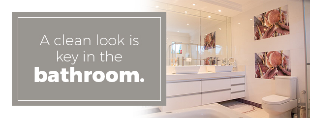
A clean look is key in the bathroom. Many people also aim for a spa-like feeling, but another factor to consider is the type of color that flatters you. Think about the colors you choose for your wardrobe. Are there certain colors you always avoid because they don’t work with your skin tone or overall look? If you add those colors to your bathroom, you may not like what you see in the mirror. Choose a color that flatters you, so you look your best when you’re getting ready in the morning.
White is often used in bathrooms for its sense of cleanliness. White works well on everything in the bathroom from walls to towels. Various shades of greens and blues create the spa-like Zen feeling that is so popular in bathrooms.
Home Office Colors
Productivity is the name of the game when it comes to your home office. You want to work efficiently to get your to-do list done. You may want to stimulate your creativity, depending on the nature of your work.
Blue is often associated with productivity. Green is another color recommended for home offices for its effects on your concentration. Both colors also have a calming effect, which can help you keep your cool when your work gets a little stressful.
Entryway Colors
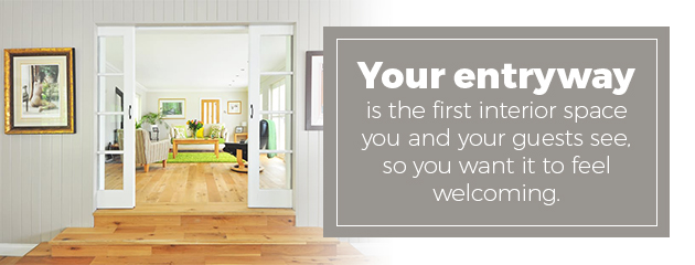
Your entryway is the first interior space you and your guests see, so you want it to feel welcoming. Choose warm colors to achieve that welcoming feeling. The proximity to the outdoors also means you should consider your home’s surroundings when choosing color. Choose an entryway color that complements the colors of nature outside your door. You might also want to create a contrast to those colors. For example, if you live in an urban area with a gray, dull appearance, you may want to instantly escape that feeling when you step inside by using a warm or bright color.
How to Choose Room Colors
You know the psychological effects of colors you’re considering, but how does that translate into paint color choices? If you’re still not sure whether to choose a creativity-stimulating orange or a tranquil, balancing green, take some time to fully analyze the room, its uses and your desires for the room.
Consider these factors and tips to help you analyze that information:
Room’s role: What are the main activities in the room you’re painting? A bedroom is a place for rest, relaxation and sleep, for example. You home office is a place for efficiency, creativity and work. Think about how you use the room and how color choice can affect those functions.
Desired feeling: Think about how you want to feel when you walk into a room. While some rooms have a common feeling, other rooms vary depending on your preference. Most people want a tranquil, restful environment in the bedroom to encourage good sleep, for example. You might prefer your home office to have a warm cozy vibe that stimulates your creativity. Someone else might prefer the calming, clear-thinking effects of blue in a home office.
Color location: When you choose a particular color for your room, keep in mind you don’t have to paint the entire room that color. You might use the color on an accent wall or on one part of the room. Another option is to choose a more neutral color for your walls and bring in the color through your drapes, furniture, throw pillows and decorative pieces. Those pops of color in your accents still offer the same effects on your mood, just in smaller doses so they don’t overwhelm the room.
Color combinations: Another thing to consider is how different colors work together within your color scheme. Most people don’t use a single color for everything in the room. Consider both the primary room color and your main accents and how those colors work together when designing your room. For example, putting pink and green together prevents either from feeling overwhelming. The combination creates a playful tone. Certain colors put together might have the opposite effect, making both feel more vibrant rather than toning down the colors.
Nearby colors: Open floor plans often give you a clear view of multiple rooms at once. If you’re only painting one of those rooms, it’s important to consider how the new colors work with the existing colors.
Lighting considerations: The lighting in your room can have a major impact on how a color looks and the mood it creates in your room. Whether that light comes from natural sources or overhead lighting also makes a difference. Testing out a color in your space gives you a better sense of the mood it creates in your home versus the mood it creates on a paint chip at a store.
Personal differences: While colors tend to have similar effects on people, you may find your reaction to a particular color doesn’t follow those standard definitions. If you’re not a fan of blue, you may not find it at all relaxing, which makes it a poor choice for any room in your home. Having a general idea of the effects of colors helps you get started, but pay attention to your own reactions when you’re choosing paint.
The aesthetic effect is always important, but choosing paint colors to lift your mood, stimulate creativity, encourage conversation or create a sense of relaxation based on your intended feeling can help personalize your space. Get started on your perfect paint color search with the color psychology guidelines in mind. Ultimately, you should choose a color that fits your personality and one you can live with long-term.
Can Paint Color Impact a Child’s Mood?
Studies have shown that colors can stimulate different parts of the brain and have an effect on mood, and that is no different for children. It’s well known that warm colors like red, orange and yellow tend to be more stimulating, while cool colors like blue and green can feel more peaceful. While you don’t necessarily want to be completely ruled by potential mood effects when deciding on the best room color for your kids, here are some feelings that have been associated with different colors that may be helpful to know.
Red: Red is a color that you will typically want to use sparingly in your child’s room. There is a reason that bullfighters use red capes to stimulate a charging bull — even though the bull cannot actually see the color red. Red is an extremely stimulating color, associated with passion and anger, and can increase heart rate, blood pressure and appetite. While a little stimulation for your child can be healthy, you’re not going to want your child seeing red everywhere when you’re trying to get them to go to sleep for the night.
Pink: Pink is the pacifist shade of red. Even though it is in the red family, its much lighter tones tend to be extremely calming. Some prisons even use pink quite liberally on walls and uniforms to diffuse hostility among inmates. There are a couple of downsides to pink, though. It can wear on the eyes, and children may get tired of pink everywhere after a while. Also, pink is often still perceived as a feminine color that could mean your son may object to an excess of pink. Like red, pink is usually better for accents or trim than as the main color for the room.
Yellow: Yellow is a bit of a mixed bag when it comes to a child’s room. The color yellow has been shown to be a concentration and memory booster, so if your child has trouble focusing, you may want to consider it when painting their room. Yellow is also an upbeat, happy color, although it can be a bit stimulating. If your child has trouble settling down, especially at night, you may want to temper your use of yellow.
Orange: The last of the warm colors, orange falls somewhere in between. It is slightly less stimulating than red and a bit more stimulating than yellow, while still being a cheerful, confident color. Use it sparingly, but you can go a little heavier with orange than with red.
Purple: While purple is a cooler color, and one that can inspire creativity and passion, it can also be a little bit stimulating, so you may not want to go overboard with purple.
Blue and Green: The classic cool colors are great for a child’s room, or for an adult’s bedroom for that matter. These colors stimulate feelings of peacefulness and tranquility. They can be quite soothing and make us think of nature. These are great colors for children who are anxious or overstimulated.
Remember that you don’t have to, and often don’t want to, paint a room only one color. Consider the different attributes of these colors as well as your child’s desires in order to come up with a great kids’ room paint scheme.
If you’re looking for a painting contractor and live in Fairfield County CT, Westchester County, NY or surrounding areas please feel free to contact us today.