How to Match Paint Colors: Paint Pairing Guide
May 31, 2023
Jump to:
- Choose the Desired Mood
- Use the Color Wheel
- Consider Sight Lines
- Pick Your First Color
- Find Inspiration All Around You
- Balance Light and Dark Colors
- Versatile Neutral Combos
- Bold Color Pairs
- Classic Color Schemes
- Monochromatic Color Schemes
- Additional Tips for Coordinating Paint Colors
- FAQs About How to Match Paint Colors
You can spend hours comparing paint swatches just to pick one wall color. And if you try to choose multiple colors for the same space, and you may start to wonder if you really need to paint at all. Before you start having nightmares about choosing colors, check out our paint pairing guide to help you narrow down the options.
Choose the Desired Mood
You can pick colors based on what you like, but it’s equally important to understand the psychology of color when choosing paint color palettes.
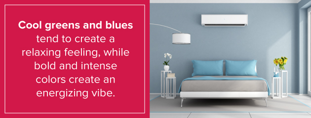
Color influences how you feel when you enter a particular room. Cool greens and blues tend to create a relaxing feeling, while bold and intense colors create an energizing vibe. Pastel colors create an open, airy feeling. Neutrals take on a variety of looks depending on how you use them and the other colors you choose for the room.
Before selecting room colors, decide what type of mood you want for each room. Do you want a calming, soothing bedroom that eases you to sleep? Do you want a bright and stimulating bathroom to wake you up in the morning or a relaxing spa-like retreat? Do you want a formal, neutral dining room or a casual space that encourages socializing?
Whatever feeling you’re trying to achieve, keep that mood in mind as you choose your colors to ensure they help create that feeling.
Use the Color Wheel
The color wheel you may remember from high school art class can be the perfect tool for picking multiple paint colors for your house. The wheel helps you choose complementary colors — which are located opposite one another on the wheel — to find combinations that look great together. When you choose complementary colors, both hues look brighter and cleaner than they might when paired with a different color. The color wheel consists of three types of colors:
- Primary colors: The primary colors are red, blue and yellow.
- Secondary color: The secondary colors occur when you mix primary colors. They are orange, green and purple. On the color wheel, they appear between the two primary colors used to create them. For example, orange falls between yellow and red.
- Tertiary colors: These colors occur when you mix secondary colors with primary colors. Examples include yellow-orange, blue-green and blue-violet. They fall between the primary and secondary colors used to create them. Red-violet shows up between red and violet on the color wheel, for instance.
How does all this help you with wall color matching? When you’re looking for colors to pair, look across the color wheel to choose complementary colors. Green lies across from red on the wheel. In a kitchen featuring cabinets with reddish wood hues, a green wall color works well. Yellow-orange appears across from blue-violet, so you might use one as the main wall color and another as an accent color.
Explore the different complementary color pairs from the color wheel to find inspiration for choosing your color scheme.
Another strategy is to pair colors next to one another on the color wheel. These are called analogous color schemes, and they create a casual look in your space. Green and blue is a common color combination used to create a relaxing look.
Consider Sight Lines
You can choose a different color palette for each room in your home, but keep in mind that no room exists in a bubble. When standing in one room, you can often see other rooms in the home. This is even more prominent in an open concept home. Choosing different colors for each room helps define the spaces, but those colors should also look good together.
When choosing color palettes for multiple rooms at once, start with the largest or most prominent space. You can also start with the room in which you want to use the boldest color scheme or a room for which you already have colors in mind. Continue choosing colors for rooms surrounding that main room, keeping in mind how well your choices work together.
Pick Your First Color
You have to start somewhere when choosing different colors that go well together for your home interior.
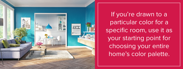
If you’re drawn to a particular color for a specific room, use it as your starting point for choosing your entire home’s color palette. You don’t have to choose your dominant color first. Perhaps you have an accent color in mind. Build from there by choosing colors that work well with your must-have color.
Find Inspiration All Around You
Look around your home, nature and the businesses you frequent for color inspiration.
The design elements you already have in your home provide a good starting point. You have those pieces in your home because you find them attractive, so it makes sense to look to those elements for color inspiration. Consider artwork, rugs and accent pieces you own. What colors do they use? Do you like the way the colors look together? Would you like them on a larger scale throughout your home? If you prefer neutral colors for your walls, look at the neutral elements in those patterns and designs. If you want a bold accent wall, look at the brighter colors in those décor pieces.
Businesses like retail stores, restaurants and offices may also provide some inspiration. Look at the displays in your favorite stores. What colors do they use that look good together? What wall colors do they favor? Many use boring white, but others will inspire you with beautiful or unique color combinations.
Mother Nature is another great source of inspiration for color combinations. Green is a prominent color in nature, and it’s also a great color to use in your home. It works well with many hues, including other shades of green.
Even your closet can inspire room color choices. Look at the color combinations in your favorite dresses, shirts and other items of clothing.
Some of these inspirational color combinations may look great in artwork or on clothes, but they aren’t quite what you want on your walls. However, they do give you an idea of the colors that work well together and they may inspire similar color palettes that do fit your preferences.
Balance Light and Dark Colors
Colors are described as light, medium or dark in value. A single color can come in various values. For example, you can have light, medium or dark blue. Most design schemes use all three values in each room to create contrast. Keeping those values in balance and knowing where to use each type of color helps you create an appealing design.
Lighter values are often found on the walls and floors, with the floors generally slightly darker than the walls. A general rule of thumb is to decorate from dark to light, starting at the floor and moving up to the ceiling. Your medium values come into the space through window coverings and furniture pieces. Accent colors tend to pull in the dark values, with the dark colors spreading through the room for pops of contrast.
Versatile Neutral Combos
Neutral doesn’t equal boring — and white and off-white aren’t the only choices. Neutral colors range from very light to dark. Gray, beige, brown, tan and black are considered neutral colors in a decorating scheme. You can pair light neutrals with dark neutrals to create dramatic contrast in the room.
Within each neutral color, you can find hues with cool or warm tones to help create the overall feeling you want. You can also pull in other colors if you don’t want a totally neutral room. Paint an accent wall to wake up a light neutral room, for example. Adding bold accents also brightens up a neutral room.
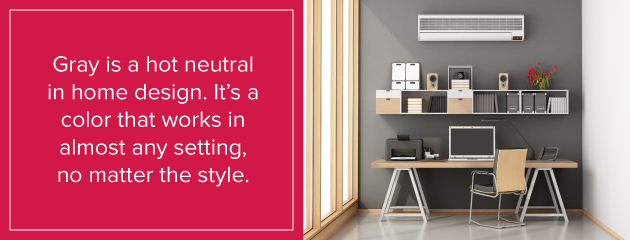
Gray is a hot neutral in home design. It’s a color that works in almost any setting, no matter the style. If you want to keep your paint color relatively neutral overall, choose two different shades of gray as your color palette. Select grays that are significantly different to create greater contrast. One shade lighter or darker on the same paint chip won’t make a noticeable difference on the wall, so it’s best to jump to a different paint sample or jump multiple steps on the same paint chip.
Bold Color Pairs
When done well, a bold wall color creates a beautiful and invigorating look in your room. But the key to avoiding a circus-like atmosphere is balance. Stick with one bold color and balance it with lighter colors. Neutrals, such as white or gray, often come to mind, but you can also use other colors to tone down the bold so it’s not overwhelming.
Classic Color Schemes
Some color pairs work well together naturally. These color schemes are frequently found on the pages of decorating magazines and in décor pieces. Classic color schemes offer an easy way to choose your palette because you already know the colors pair up well. Consider these classic color combinations:
- Dark blue and white
- Pale blue and bright red
- Black and white
- Red and gold
- Pink and green
- Green and yellow
- Green and blue
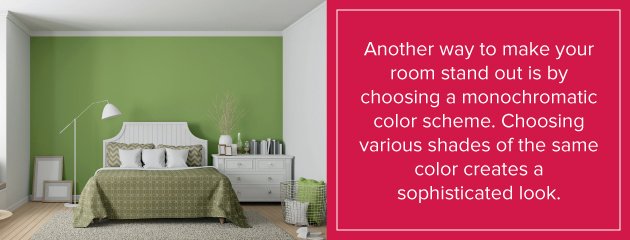
Monochromatic Color Schemes
Another way to make your room stand out is by choosing a monochromatic color scheme. Choosing various shades of the same color creates a sophisticated look. Monochromatic does not have to mean black, white or gray. You can create a monochromatic look around a bold color, such as green or blue.
To create the monochromatic effect, choose your feature color. Then pick three shades of that color, with a light, medium and dark choice. Use one of the three colors as your primary wall color, depending on how bold you want the look to be. Use the other two shades in the accents for the room.
You can add other colors in a monochromatic room to break up the look and make a dramatic element in the space. You might add white or black to the space for some contrast.
Additional Tips for Coordinating Paint Colors
Learning how to match paint colors in different rooms can seem overwhelming, but it doesn’t have to be a challenging decision. If you’re still not sure how to choose multiple colors, keep these tips in mind:
Limit color choices: It can be difficult to narrow down your choices, but don’t overwhelm a single room with too many colors. A general rule of thumb is to stick with three colors.
Look at the bottom of the paint chip: When you look at paint strips, you’ll notice the top color is the lightest and the bottom color is the darkest. If you only look at the top colors, the light colors look similar. Instead, focus on the dark bottom color. Choose a darker color you like and that you can live with. You can then pull lighter colors from those strips to choose your coordinated colors.
Reflect your personality: Don’t focus too much on the trends and what you “think” you should paint your home. Choose what looks great to you. Infuse your personal decorating tastes into the home to create a space you love.
Mix warm and cool colors: When choosing multiple colors, you don’t have to choose only cool colors or only warm colors. Pairing warm and cool colors together can create a pleasing contrast and help balance out the room.
Test color combinations: Before you start painting walls, buy small samples of all the paint colors you select. Paint them onto large pieces of cardboard and place them in the room next to one another to see how they look in the space.
Take your time: When you’re ready for a change, you want that change right away. But choosing colors you can live with for years takes a little more time. When you choose your colors, keep your painted samples in the room for several days, viewing them at different times of day to see how they look.
Note lighting: The way paint color combinations look often depends on the lighting in the room. You get the truest idea of how two colors work together in natural light. Those colors may appear different as sunlight shifts and you use supplemental light. For example, incandescent lighting emphasizes warm tones and yellows. Fluorescent lighting can add a blue tone to your room colors.
Consider intensity: Bright and intense colors tend to add a sense of weight to the room. Less intense neutral colors create a lighter sense of weight to the space.
Pick finishes: The paint finish you choose can create subtle differences in the finished look. Painting the ceiling in one finish and the walls in another creates a subtle contrasting effect. You can do the same thing with walls to create an accent. Instead of choosing a completely different color for the accent wall, use the same color but in a different finish than the rest of the walls. Higher gloss finishes draw more attention, so choose the finish strategically based on where you want the most attention.
Be brave: Many homeowners tend to be conservative when choosing paint colors. While neutrals can be beautiful and even dramatic, don’t be afraid to try something bold and new. You may be surprised how much you fall in love with a bold color you wouldn’t normally consider.
FAQs About How to Match Paint Colors
Want to learn more tips about how to coordinate paint colors? Check out these common questions and answers.
How do you connect rooms for a seamless look?
Choosing matching or complementing paint colors can make your space look intentional and well-designed. Picking two or three colors can carry a unified theme throughout your home. To create a cohesive appearance and encourage better flow from room to room, repeat similar colors in elements such as fabric, wall decor or window treatments.
How do you use the 60-30-10 rule to pick matching paint?
A classic decor rule can help you create your color palette in a space. About 60% of your room should have a dominant background color. Around 30% should include a secondary color or texture. The remaining 10% of the space should have either a bold or subtle accent color you love.
What’s the best way to pair paint colors with wood types?
Wood provides natural warmth and texture in a living space. Picking the right paint colors to match your wood furniture, trim and flooring can make the room more visually pleasing. Assess the undertones in the wood grains and patterns to decide if you should choose a matching warm or cool shade of paint.
You can keep the environment neutral or play around with creative choices. Once you pick out your dominant wood tone and supportive colors with paint, it’s time to create a balanced atmosphere. Instead of bunching hues together, carry them throughout your space.
How can I pair paint with brick features in my house?
Many homes feature brick fireplaces or accent walls. This material offers an earthy finish and works well with organic-inspired color palettes. Since many brick varieties come with a red tone, you’ll want to avoid crisp shades of white.
A warmer color, like a light greige or tan, looks beautiful with brick. You can sit down with a color consultant at Shoreline Painting to find the best paint choices to pair with accents like brick, marble, granite or wood in your home.
When You’re Ready, Contact Shoreline Painting for Professional Results
If you live in Fairfield County, CT or Westchester County NY, contact Shoreline Painting for all of your professional painting service needs. We can help you finalize your paint combinations to create a stunning space full of colors that work brilliantly together.
Recent Posts


Follow Us


